Text
text draws words. The point after at is where the top of the text goes:
background 250fill 30text "Hello" at 30 40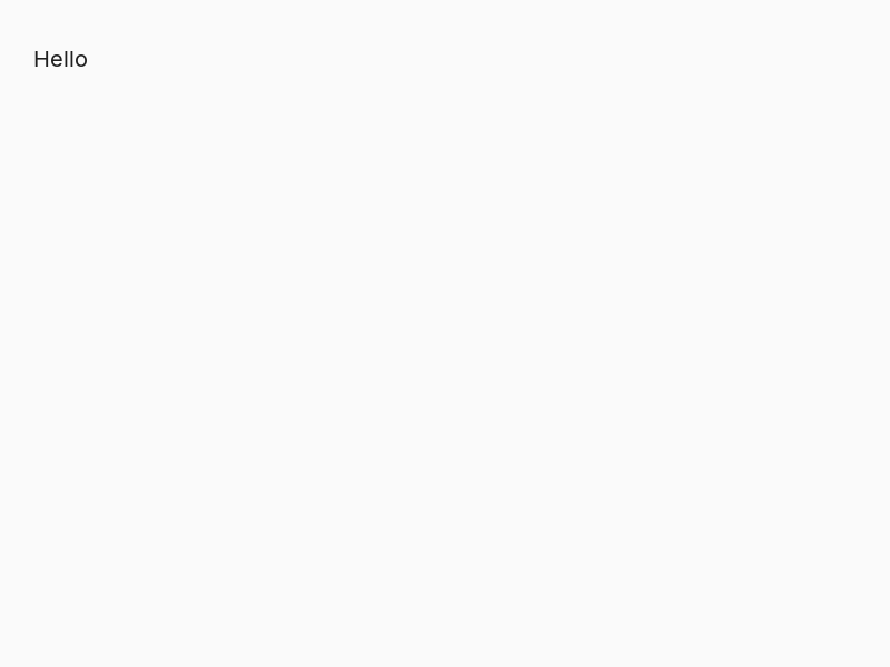
The words are in Inter, which comes with rocinante, so a sketch looks the same on every computer. text takes the same style words as a shape (fill, alpha, and so on), and size and font as well:
background 250fill 30text "Hello" at 30 30 size 60fill tealtext "in teal, and bold" at 30 120 size 24 font "Inter Bold"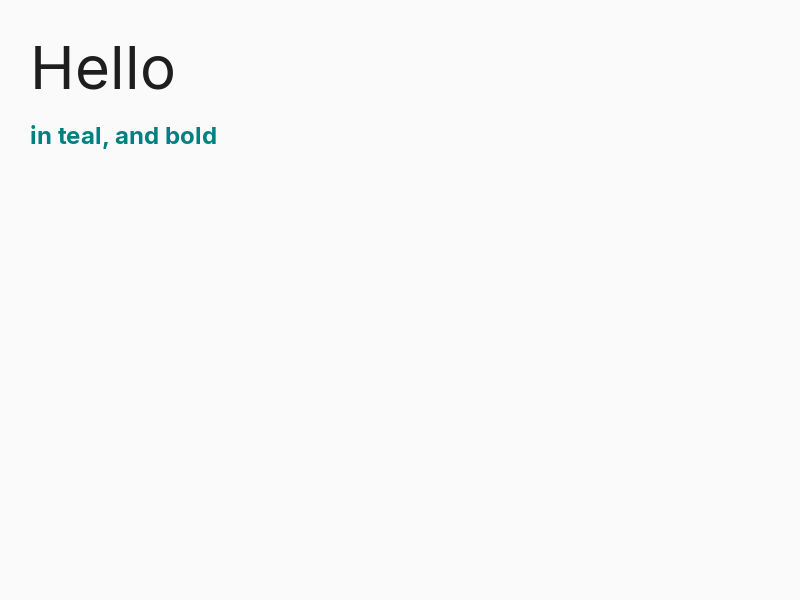
Setting the font
font and size set the font for the text that follows, as fill sets the color. Like every style, they start again at each frame:
background 250fill 30font "Inter Bold" size 40text "Bold" at 30 30font "Inter" size 40text "Regular" at 30 100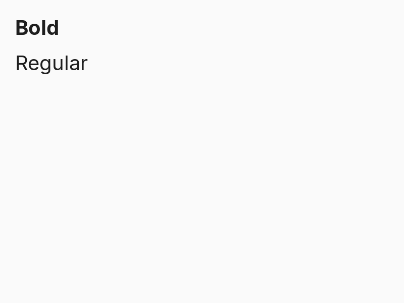
The two fonts built in are Inter and Inter Bold.
Lines against a point
align says where each line sits against its x: left (the default), center or right. A line break in the text (\n) starts a new line, and width makes a long text wrap, so no line is wider than that:
background 250stroke grayline from 200 20 to 200 280no strokefill 30font "Inter" size 22align lefttext "left" at 200 40align centertext "center" at 200 90align righttext "right" at 200 140align lefttext "A longer text breaks into lines by itself when it has a width." at 20 190 width 360 size 18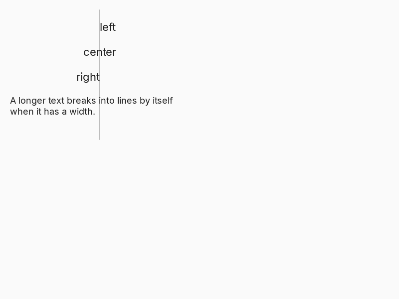
Space between lines
leading sets how far apart the lines of a text are, as a multiple of the size: 1.5 puts the baselines one and a half sizes apart, 1 packs them closer, and 0 (the start) is the font’s own spacing. Like font and align, it can be a line of its own, lasting until changed, or a word of one text:
background 250fill 30font "Inter" size 20text "The font's own spacing,\nbetween these lines." at 30 30leading 1.8text "Leading 1.8 opens\nthe lines out." at 230 30text "Or a word of one text,\nleading 1." at 30 160 leading 1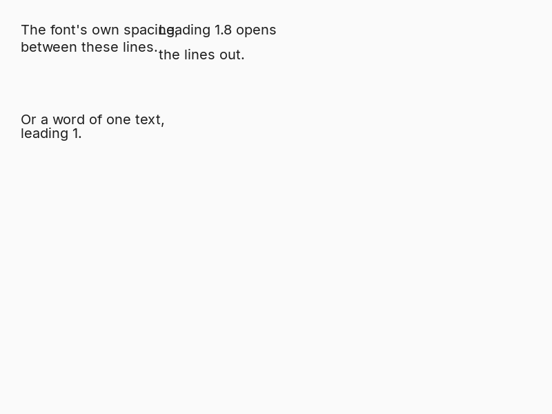
Measuring
measure gives the size of a text in the current font, as a vector of its width and height. That is how to draw a box that fits it, or put one thing after another:
background 250font "Inter Bold" size 32box = measure "fits"fill goldrect at 40 60 size boxfill 30text "fits" at 40 60text "next to it" at (40 + box.x + 16) 60 size 32 font "Inter"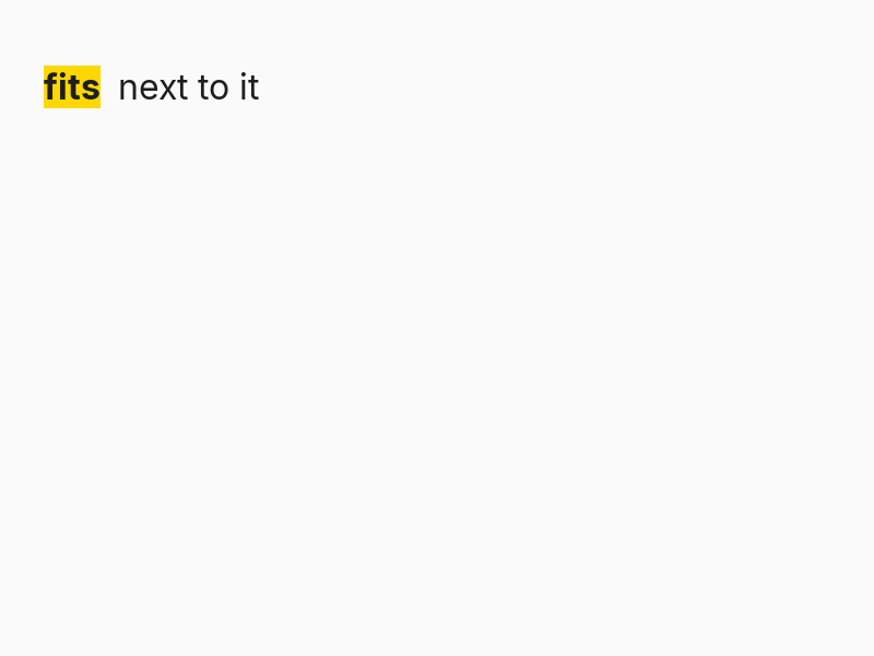
A text with nothing in it measures 0 by 0. measure follows font, size, align and leading, so set them first.
Other fonts
A font file in assets/fonts is a font of the sketch. Use it by its file name, with or without the extension (.ttf, .otf, .ttc or .otc):
font "Mono.ttf"
font "Mono"
A font that is not there is said once and the text is drawn in the font before it:
Fonts installed on your computer
Name a font that is installed on your computer and rocinante finds it: font "Helvetica Neue" looks for a file of that name in the computer’s fonts when your sketch has none. The first time, the font is copied into assets/fonts and one line says so, so your sketch looks the same on every computer and travels with its font. If the font’s own licence does not name a free one (the SIL Open Font License, Apache, Ubuntu, MIT or public domain), you get a warning too. It is only a reminder: the sketch carries on, and whether you may share the font is for you to check.
Emoji are drawn at the size of the text around them, one em wide, and measured the same way, so measure and a box around a line with an emoji in it fit.
Other scripts and emoji
Inter covers the Latin alphabets, Greek and Cyrillic. For other scripts and emoji, rocinante looks for a font on the computer (Hiragino and Apple Color Emoji on a Mac, Noto or Segoe UI elsewhere), and shapes the text properly: Arabic joins and runs right to left, Devanagari gathers its marks. Those fonts belong to the computer, so they are never copied into your sketch: where there is none, a missing character shows as an empty box. To be sure a script looks the same everywhere, put a font that has it in assets/fonts and name it.
Putting it together
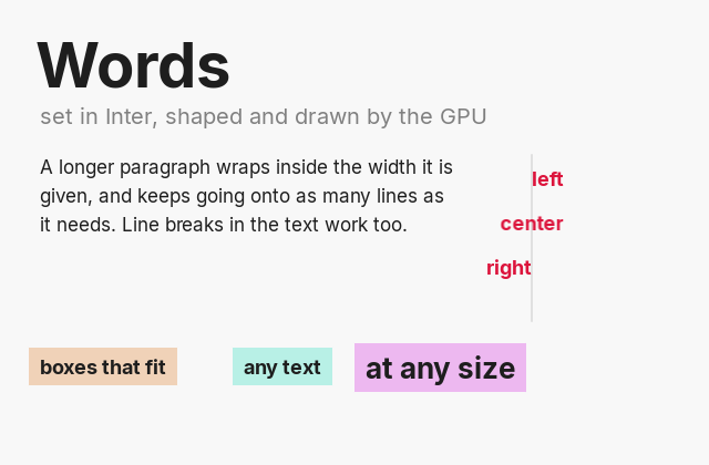
A whole sketch of words: two weights, a line aligned against its x, a paragraph that wraps, and labels whose boxes are made from measure. It is examples/text, and runs with roci run examples/text.
// Words in Inter, in two weights and many sizes. A line is aligned against its x, a long// one wraps at a width with the lines as far apart as leading says, and measure says how big a text is, so a label can have a// box that fits it exactly.window size 640 420 title "text"learn label words spot with hue 160 [ size = measure words fill (hsb hue 60 240) rect at (spot.x - 10) (spot.y - 6) size (size.x + 20) (size.y + 12) fill 30 text words at spot]draw [ background 248 fill 30 font "Inter Bold" size 56 text "Words" at 32 24 font "Inter" size 20 fill gray text "set in Inter, shaped and drawn by the GPU" at 36 92 stroke 200 line from 480 140 to 480 290 no stroke fill crimson font "Inter Bold" size 18 align left text "left" at 480 150 align center text "center" at 480 190 align right text "right" at 480 230 align left fill 30 font "Inter" size 17 text "A longer paragraph wraps inside the width it is given, and keeps going onto as many lines as it needs. Line breaks in the text work too." at 36 140 width 380 leading 1.5 font "Inter Bold" size 18 label "boxes that fit" { 36, 320 } hue 20 label "any text" { 220, 320 } hue 120 font "Inter Bold" size 26 label "at any size" { 330, 316 } hue 210]